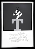
“An illumination is an embellishment, or additional decoration that enhances the pages of a written, or manuscript page. The decorated pages made it easy for missionaries to find the beginning of a particular section.” Often, these illuminated letters were adorned with gold leaf and painstakingly hand painted. Evidence of the art of illumination exists from as far back as 400 AD and stretches to the 16th century with the art’s height peaking in the Middle Ages. The majority of surviving texts are religious in nature and include such works as the Aberdeen Bestiary (12th century English), Book of Hours (1400s French), Li Livres dou Santé (13th century French) The Book of Dimma (8th Century Ireland), The Book of Kells (ca. 800 Celtic) and in countless Bibles.
ALAN FLETCHER ǀ eyecatching
Alan Gerard Fletcher (27 September 1931 – 21 September 2006) was a British graphic designer. In his obituary, he was described by The Daily Telegraph as "the most highly regarded graphic designer of his generation, and probably one of the most prolific".
I chose Alan Fletcher because of the unique creations that he has made. He combines mediums and compositions into his own, and they become different enough to be separated from other similar artists.
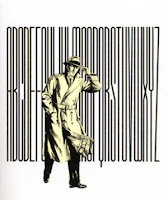
ROBERT DE NIRO SR. ǀ dramatic
Robert Henry De Niro, Sr. (January 17, 1922 – May 3, 1993) was an American abstract expressionist painter and the father of actor Robert De Niro.
I came across Robert de Niro Sr. mostly because I recognized the name. I immediately grew fond of the paintings and drawings that I found. His style is to almost "outline" his subjects, which gives off an extremely dramatic vibe.
BRADBURY THOMPSON ǀ whimsical
Bradbury Thompson (1911–1995) was an influential American graphic designer and art director of the twentieth century.
I recently did a research project on Bradbury Thompson for another class, and really recognized the talent that he had. He was a lifelong artist and really affected everywhere he was during his lifetime. He mastered the use of primary colors and brought movement to a flat surface.
HERE IS A LIST OF POSSIBLE DESIGNERS THAT I COULD CHOOSE FROM FOR PROJECT 4 IN TYPE 1:
BRADBURY THOMPSON – WestVaco
GIAMBATTISTA BODINI – Bodini Typeface
MAX MEIDINGER – Helvetica Typeface
ALAN FLETCHER –Victoria and Albert Museum
WALTER LANDOR – FedEx
ROB JANDOFF – Apple
CAROLYN DAVIDSON – Nike
NEVILLE BRODY – record cover designs
GORDON PARKS – American photography
I FOUND A GREAT LINK OF POSTERS DESIGNED WITH A MINIMAL MINDSET. THEY ARE RE-REPRESENTING FAMOUS TV SHOWS AND REALLY SAY SOMETHING WITHOUT SHOWING MUCH. ALMOST EVERYONE OF THEM RESONATED WITH ME AND I ENJOYED LOOKING THROUGH THEM.
THE IDEA IS TO LOOK AT THE POSTER, NOT COMPLETELY UNDERSTAND WHAT IS SAYING, WATCH THE SHOW, AND THEN UNDERSTAND.
http://www.pvmgarage.com/2010/01/minimal-and-retro-poster-design-two-stunning-and-inspirational-projects/
THERE IS A SECOND GROUP OF POSTERS THAT SHOWS WEBSITES THAT WE GO THROUGH A LOT. THEY ARE ALL MOSTLY A LITTLE GRUNGY AND CROWDED, BUT I DID FIND A COUPLE WORTH LOOKING AT. THE CONTENT OF THEM IS WHAT IS MOST IMPORTANT I BELIEVE.
ANYWAYS, I THOUGHT THE FIRST SET OF POSTERS IS GREAT TO LOOK AT FOR OUR CURRENT VISUAL CONCEPTS PROJECT.


